Design Folio
For many years I have made artworks for bootlegs to explore design and expand my design skills and software knowledge.
All the images have been created using Photoshop, Nuke, DSLR and scanner.
Many images have been produced to explore my interest in design and typography. They have also offered an opportunity to approach digital
imagery in a way that is different to the photo-real approach required by my work in visual effects.
They form a digital sketchbook of ideas.
To contact me
please email me at: effects@jamielochhead.co.uk
This page features a number of my favourite designs I have made. Please click on the images to link to the full set of artworks for that design.
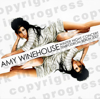
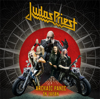
Vinyl artworks.
I have been fortunate to make some recent designs for vinyl releases, which have allowed me to work in greater detail than many of my earlier designs.
Please click on the images for more details.
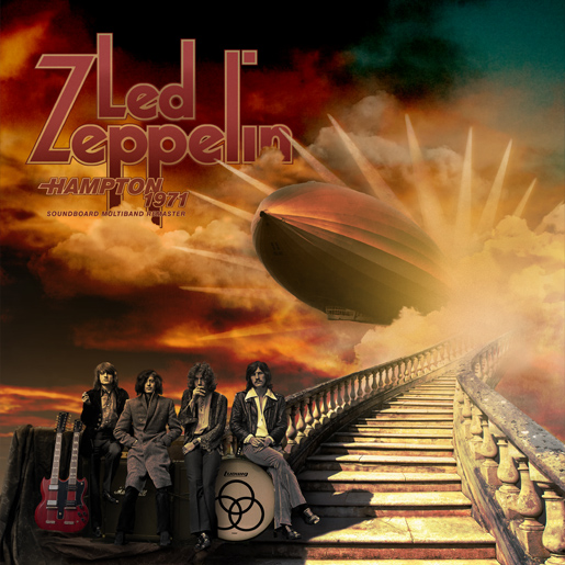
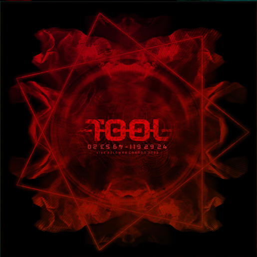
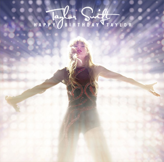
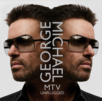
Click on the above artworks for vinyl artworks for each artist or genre.
Bowiestation.
The following images have been created for the Bowiestation forum over the last few years. There are many more on my main artworks page.
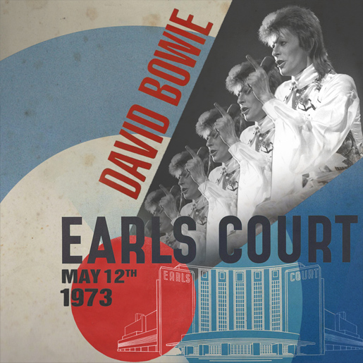
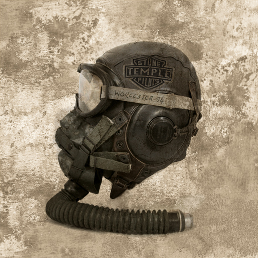
Based on World War II propaganda posters, this design has a period feel to the typography, and draws on the modernist elements of WW2 posters, as well as the patriotic colour scheme/RAF roundel.
|
|
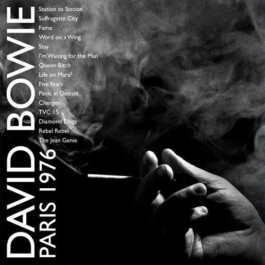
A black and white image following the clean style of Bowie's 'Thin White Duke' period. The photograph is of my hand holding a pencil. Stock footage of smoke was added with Gill Sans used for a clean and English feel to the type. |
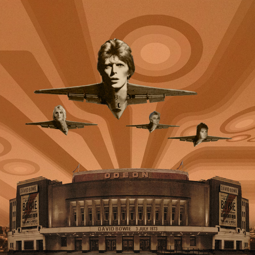
A retro 70's feel, using a collage of images and graphic shapes. The idea of the band's faces on aircraft just seemed to work, influenced by surreal imagery and also the absurd humour of Monty Python. |
|
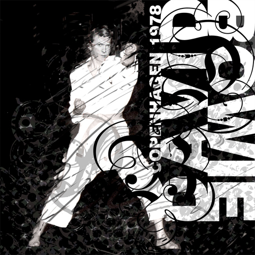
Based on a family photograph of a martial arts class. Bowie's face was added from an internet image. Textures and typography were created in Photoshop.
|
Other artworks.
Desktop backgrounds.
To go with some of the CD inserts I have made, I also created some desktop backgrounds. These images were wholly created by myself, the first uses a family photo,
the latter from a series of photographs I took in the YTV costume department. Textured and aged in Photoshop, using scans of foam, canvas and old school books.
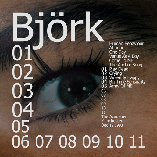
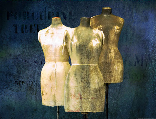
These are again from a series of images I made for shared recordings of Porcupine Tree tour. To see the fifty nine CD artworks please click here.
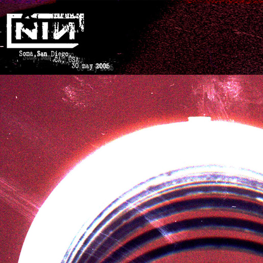
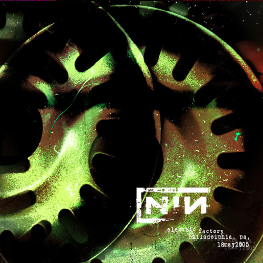
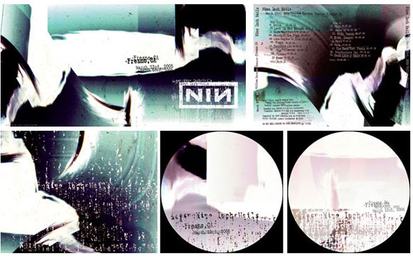
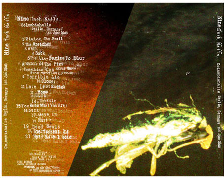
Nine Inch Nails 2005 tour project.
Sixty artworks were made for the project, each being done within a few hours of a recording being shared. The bottom left set of images were the first created and
came from my cat sitting on my scanner, this formed a method I used on all images taking found objects and processing them using the scanner and Photoshop.
With the exception of using the band's existing logo, these designs were wholly created by myself. The type is 'hand cut' (in Photoshop) to give a grunge feel.
Using stock/existing images .
Combining images from Galveston showing damage from Hurricane Carla, as was used on the original 'Permanent Waves' album cover. I have combined several images
to make one seamless image for this artwork. The source images used can be seen on the back insert on the linked page. The band's names have also been matched
into the advertising signs, again following the original cover as does the typographic style used.
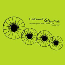
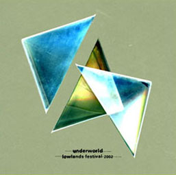
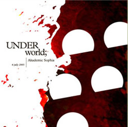
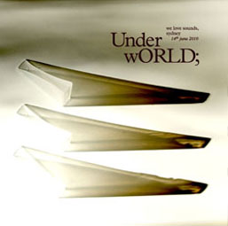
Underworld/RTSR.
The above images were created following the style Underworld's album covers for the RTSR forum. The images are wholly generated by myself, but loosely follow
Tomato/John Warwicker's typographic style. The first three use images were generated using a scanner, the fourth a DSLR. Click the images for the full artwork
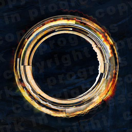
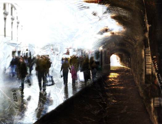
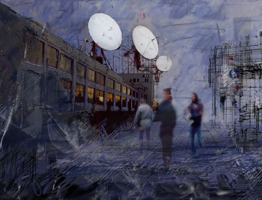
Photographic/digital collage.
The above images above are made from photographs, sketches, pastels, texture scans, and are wholly created by myself. Unlike many of the images below,
these were not made to any specific brief, but simply to explore the possibilities of digital image manipulation, to achieve a more organic and illustrative feel.
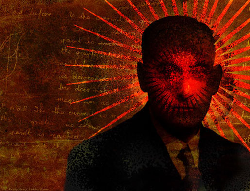
Exploring different styles.
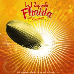 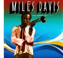
The above images were created to explore the decorative style of the mid 00's.
The zeppelin and portrait photograph as well as some of the textures are stock sources, but the style, colour and layout are mine.
|
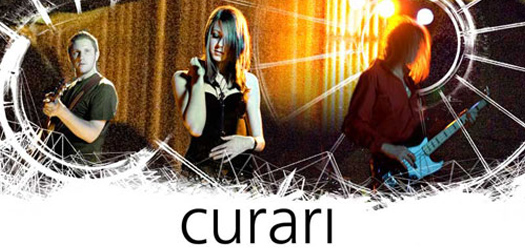
This image was part of a website header for a band I was involved with. Live photographs were combined with textures in Photoshop. Frutiger is used for
the logo removing the dot on the 'i' for symmetry. |
All designs.
More of the cover designs I have made, together with desktop backgrounds can be found on my 'CD and desktop backgrounds' page.
Most are wholly my own design, though a few simply rework promotional material, it shows an exploration of design ideas.
Some are successful, others not so, but they exist as a sketchbook where I can try out ideas.
The page is not a portfolio page, but is shared as a resource for collectors of rare recordings.
|
|